
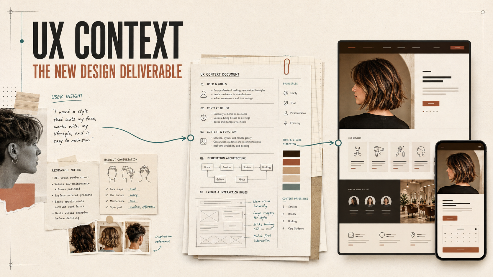
Ask AI to “build a modern, professional website for a hair styling service with online booking,” and the result may look complete: a hero, service menu, stylist profiles, testimonials, and a booking form. Complete, however, does not mean correct.
The page may push “Book now” before a client understands the difference between services. It may use polished photography while hiding price ranges, treatment time, and hair-condition limitations. It may also expect a first-time color client to decode technical terms alone. These are not merely visual flaws. They are product decisions the AI made because the context was missing.
When AI generates an interface, it also makes design decisions
Traditionally, people read research reports, requirements, journey maps, and design systems, then translated them into an interface through discussion and iteration. Generative AI compresses that chain. A single natural-language request can produce an information architecture, content hierarchy, interaction pattern, and visual system at once.
But the model cannot tell which decisions are intentional and which are just common patterns in its examples. Give it only a feature list, and it will fill the gaps with whatever looks statistically “website-like.” The output can be usable and attractive while remaining disconnected from the particular people and service behind it.
What is UX Context?
UX Context is not every research artifact pasted into a giant prompt, nor is it simply a longer specification. It is a selected, structured set of facts and decisions that can materially affect generated output: who the users are, what they are trying to accomplish, what concerns them, how the service works, how the brand communicates, and which outcomes are unacceptable.
Its value is that it converts tacit judgment—scattered across interviews, workshops, support logs, and designers’ heads—into a shared foundation that AI can use and the team can inspect.
What belongs in AI-ready UX Context?
1. Users and situations
“People aged 18–45 who care about appearance” is too broad. Describe when they arrive, what they already know, and what they fear. For example: “A first-time color client who worries about hair damage and surprise fees, and wants to understand suitable options before choosing between a consultation and a booking.”
2. Tasks, decisions, and success conditions
The page does not exist to display every possible piece of content. It exists to help someone decide. Success may mean finding a suitable service, understanding the likely price, choosing a stylist, completing a booking, or recognizing when a consultation is the safer next step.
3. Content priority
State what must appear first and why. A portfolio matters for a hair studio, but if price, duration, and suitability are buried, the user still lacks the confidence needed to act.
4. Flows, states, and exceptions
The happy path is easy to generate. The real experience includes unavailable dates, appointments that would run past closing time, a chosen stylist being away, upload failures, duplicate bookings, and cancellation rules. Context should identify important states and what the interface must do in each one.
5. Brand principles and testable constraints
“Premium and professional” is too vague. A usable instruction is: “Provide clear information before persuasive copy. Do not promise a guaranteed hair result. Never show a starting price without explaining common surcharges. Keep primary mobile actions within easy reach.”
| Generic prompt | AI-ready UX Context |
|---|---|
| Build a professional hair-booking website. | First-time color clients need to assess fit before booking. Show price range, duration, surcharge conditions, and a consultation option. |
| Make it minimal and premium. | Use portfolio images to build trust without letting decoration overpower price and booking information. Use warm neutrals, clear hierarchy, and restrained motion. |
| Add a booking form. | Use the sequence service, stylist, date, time, contact details, and confirmation. Preserve every selection when the user goes back. |
Copy-ready example: AI-ready UX Context for a hair styling website
This is not a universal template. It is a starting point designed to reduce the number of guesses an AI system must make. Copy it, then replace the example assumptions with your own research, service data, and brand principles.
# AI-ready UX Context: Afterglow Hair Studio service and booking website

## 1. Project goal
Create a mobile-first website for a professional hair styling studio.
The site must help clients understand service differences, cost, and time before guiding them into booking.

Primary success criteria:
- A client can identify a suitable service within two minutes.
- Before booking, the client understands the price range, estimated duration, and common surcharges.
- After booking, the client knows the date, time, location, preparation steps, and cancellation method.
- Reduce manual follow-up caused by a wrong service choice, price misunderstanding, or missing hair-history information.

## 2. Primary users
### A. First-time color client
- Unfamiliar with terms such as bleaching, toning, and bond treatment.
- Worried about damage, disappointing results, and unexpected fees.
- Needs plain-language explanations, examples, and a consultation option.

### B. Returning maintenance client
- Already knows the service and preferred stylist.
- Wants to find availability and book quickly.
- May repeat the previous service but must still confirm current price and duration.

### C. Client with a fixed event date
- Needs styling for a wedding, interview, performance, or shoot.
- Cares most about completion time, durability, and rescheduling risk.
- If timing is unrealistic, show a more suitable service or contact option.

## 3. Core context of use
- Most visitors arrive on mobile from a portfolio post on social media.
- They may know the effect they want but not the service name.
- They may be using the site during a commute or short break.
- When comparing services, they need to see outcome, suitability, duration, and price range together.

## 4. Core tasks and priority
1. Find a service by desired result or problem to solve.
2. Understand inclusions, price range, duration, and limitations.
3. Review stylist expertise and relevant real work.
4. Select a service, stylist, date, and time.
5. Provide necessary contact and hair-history details.
6. Confirm the booking, policy, and preparation steps.

Do not require account registration before booking.
Do not force the user into booking before they understand the service.

## 5. Information architecture
Home:
- One clear service promise
- Find a service by need
- Popular services
- Stylists and specialties
- Real work
- Before-you-book guidance
- Primary booking entry point

Service detail:
- Who it suits
- Outcomes that are possible and outcomes that cannot be guaranteed
- What is included
- Price range and surcharge conditions
- Estimated duration
- Whether consultation is required
- Aftercare
- Book button

Booking:
Service → Stylist → Date → Time → Contact and hair details → Confirmation

## 6. Service-data rules
Every service must include:
- Service name
- One-sentence description in client language
- Suitable needs
- Conditions that require consultation
- Price range
- Possible surcharges, such as hair length, density, or product choice
- Estimated duration
- Whether wash, cut, treatment, and styling are included
- Eligible stylist level
- Relevant portfolio examples

Never show only “From $X” without explaining common reasons the final price changes.

## 7. Booking-flow rules
- Ask only for information needed at the current step.
- Show progress and a summary of current choices.
- Preserve all input when the user goes back.
- After service selection, show only stylists qualified for that service.
- After stylist selection, show only that stylist’s available times.
- Include service duration and buffer; never allow a booking to run past closing.
- When no slot is available, offer another stylist, another date, or a waitlist notification.
- The final review must show price range, duration, address, and cancellation policy.
- After submission, show a success state with add-to-calendar and contact options.

## 8. Hair details and privacy
Ask only for information that affects service decisions:
- Current hair length
- Bleach, dark dye, or perm history within the last year
- Scalp sensitivity or known allergies
- Desired result and reference image (optional)
- Anything the client wants the stylist to consider (optional)

Before image upload, explain its purpose, retention, and who can access it.
Do not request personal information unrelated to the service.

## 9. Important states and error handling
Design these states:
- Nothing selected
- Loading
- No available slots
- Slot taken during checkout
- Invalid field
- Image upload failure
- Deposit or payment failure
- Booking success
- Reschedule or cancellation success
- Service temporarily unavailable

Every error must explain what happened, whether the user’s data is preserved, and what they can do next.
Do not use “Something went wrong. Try again.” by itself.

## 10. Content and tone
Brand character: professional, candid, warm, and nonjudgmental about appearance.
Use familiar client language; explain necessary technical terms immediately.
Explain options and limitations before promotional claims.

Avoid:
- Guaranteed outcomes
- Appearance anxiety
- Vague pricing
- Empty words such as “ultimate,” “perfect,” and “transformative”

Use specific action labels:
- “View services and pricing”
- “Choose a stylist”
- “See available times”
- “Confirm booking”

Avoid generic labels such as “Learn more” or “Next.”

## 11. Visual and interaction principles
- Hair work and decision information are the visual priorities—not decoration.
- Use warm neutrals, clear hierarchy, and generous whitespace.
- Preserve natural skin tone in portfolio images; do not use filters that distort hair color.
- Keep motion brief and functional; honor prefers-reduced-motion.
- Avoid autoplay video, distracting parallax, and unnecessary pop-ups.
- Primary mobile touch targets must be at least 44 × 44 px.

## 12. Accessibility
- Text and backgrounds meet WCAG AA contrast.
- All functions work by keyboard with a clear focus state.
- Labels remain visible; placeholders do not replace labels.
- Errors are programmatically associated with fields.
- Informative images have meaningful alternative text; decorative images use empty alt text.
- Color is never the only signal for a state.

## 13. Responsive behavior
- Design mobile-first; content order must not depend on desktop left/right position.
- On small screens, service comparisons become sequential content rather than forced horizontal scrolling.
- A booking summary may use a sidebar on desktop but must appear before confirmation on mobile.
- Images must not crop out the important part of the hairstyle.
- A persistent booking action may remain within reach but must never cover content or system feedback.

## 14. Acceptance criteria
The generated result must pass:
- A first-time color client can find a service without knowing specialist terminology.
- Every service shows price range, duration, and surcharge conditions before booking.
- No availability, slot conflict, upload failure, and submission failure each have an actionable next step.
- Going back never erases entered data.
- The success page includes service, stylist, date, time, price range, address, and policy.
- There is no unintended horizontal scroll at 320 px.
- The complete booking flow works by keyboard.
- Service selection and booking remain understandable when images are disabled.
- Every interface section has a purpose supported by this UX Context.

## 15. Generation output
Before generating the interface, output:
1. Key user journey
2. Page and content hierarchy
3. Important state inventory
4. Design decisions mapped to the acceptance criteria

If information is missing, list questions.
Do not invent prices, policies, or available times.
Prompt versus Context is not a question of length
A good prompt still matters: it defines the current task and output format. Context supplies the reusable foundation that keeps multiple tasks aligned. A team may ask AI for an information architecture, then service pages, a booking flow, and error states. If each request relies on an improvised prompt, design principles drift.
UX Context is therefore closer to a maintained design asset. When research, service policy, or brand voice changes, update the Context first so subsequent outputs share the change.
From handoff to continuous curation
Designers do not disappear when AI can generate screens. Their role expands from delivering finished frames to curating the conditions of generation: selecting useful evidence, making judgment explicit, exposing assumptions, defining acceptance criteria, and evaluating recurring bias in the output.
That changes the deliverable. Alongside design files and component libraries, teams need Context, examples, counterexamples, state models, and quality checks that both people and AI can use.
Context cannot replace user research
A structured document can make an assumption look authoritative. Format completeness is not evidence. If Context is based only on internal guesses, AI will simply amplify those guesses more consistently. Important statements should identify whether they come from research, operational policy, analytics, or an assumption that still needs testing.
- Attach a source and date to research insights
- Separate facts, decisions, and assumptions
- Record conflicts and tradeoff rationale
- Assign ownership for Context maintenance
- Test output with realistic user tasks
- Keep counterexamples to prevent regression
The goal is not a longer prompt. It is better context.
You do not need a huge documentation system to begin. Choose one valuable flow and capture five things: the user’s immediate goal, their biggest concern, the information required to decide, important exceptions, and testable completion criteria. Generate from that Context, then observe which failures reveal a missing rule.
A mature AI design process does not expect the model to guess correctly once. It makes the basis of its decisions visible—and gives the team a systematic way to improve that basis.
Frequently asked questions
How is UX Context different from a design system?
A design system defines components, styles, and interaction patterns. UX Context adds users, tasks, content, business rules, and decision rationale. Together, they help AI remain both consistent and situationally appropriate.
Is UX Context just an extremely long prompt?
No. A prompt describes the current task. Context is a reusable and maintainable foundation. It should be structured, selective, and limited to information that can affect decisions.
Should we give AI all of our research data?
No. First synthesize insights, evidence strength, exceptions, and design implications. Remove irrelevant content and unnecessary personal data, and follow your organization’s privacy policy.
How do we know whether the Context is good enough?
Use it for a concrete generation task and evaluate the result against acceptance criteria. Repeated errors usually point to a missing rule, state, priority, or counterexample.
Do small teams need UX Context?
Yes, but it can be lightweight. Start with one page covering core users, primary tasks, content hierarchy, key constraints, and five to ten acceptance criteria.