
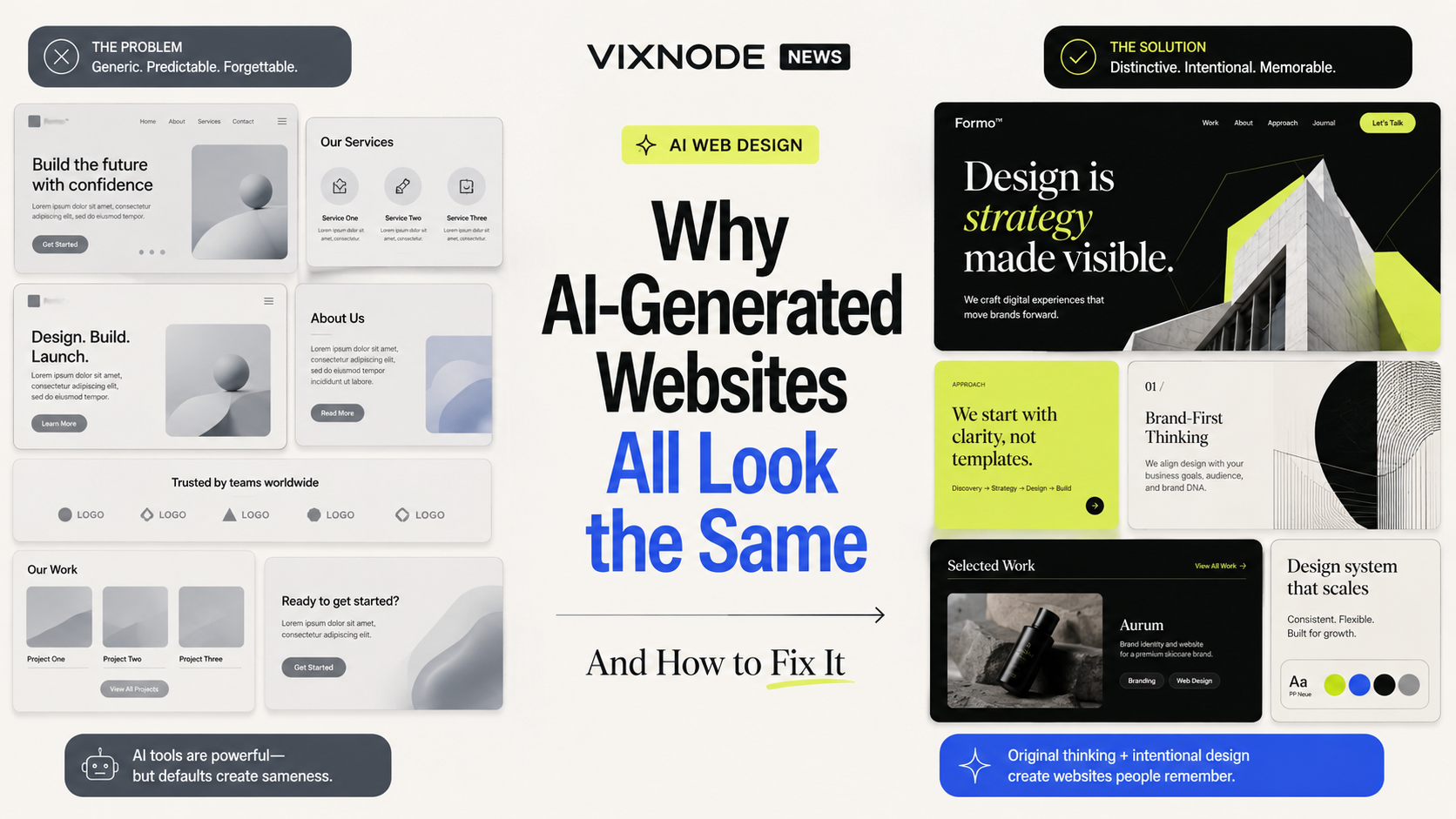
AI has made it remarkably easy to produce a website that looks good at first glance. Large hero type, gradients, rounded cards, three-column features, testimonials, pricing, FAQs — in seconds, a complete landing page appears. But give another person a similar prompt and the result often looks surprisingly familiar.
This is more than an aesthetic problem. If different brands use similar type, similar cards, similar gradients, and similar motion, a website can be technically polished while still losing the thing that matters most: recognition.
Why do AI websites converge on the same look?
Most AI web design systems are optimized to produce something reasonable, legible, and familiar before they are optimized to invent a new visual language. That naturally pushes them toward low-risk patterns.
The problem is not only AI. It is also the prompt.
“Make it modern,” “make it clean,” and “make it premium” sound directional, but they leave almost every important design decision undefined. When “modern” is not specified, AI falls back to the most common visual stereotypes associated with modern websites.
Design a modern AI startup website.
Create an editorial-style AI product website. Use strong typographic hierarchy, asymmetric layouts, minimal rounded cards, muted neutral colors, and restrained motion. Avoid purple gradients, glassmorphism, glowing borders, and generic SaaS illustrations.
Eight ways to make AI websites feel less templated
Replace style adjectives with art direction
Do not stop at “modern,” “clean,” or “futuristic.” Define typography, composition, motion, geometry, imagery, and what should explicitly be avoided.
Establish design tokens before generating pages
For multi-page consistency, define reusable rules for color, radius, spacing, and type rather than re-describing them on every page.
| Element | Example rule |
|---|---|
| Primary | #161616 |
| Accent | #DFFF42 |
| Background | #F5F1E8 |
| Radius | 6px / selective |
| Section rhythm | 48 / 80 / 120px depending on hierarchy |
Stop turning everything into a card
Cards are useful, but they should not be the default answer for every content type.
Use typography as a brand system
Typeface, weight, spacing, line height, headline scale, and reading width can change a page from “generic startup” to “design publication” or “developer tool” without changing the underlying content.
Write an explicit avoid list
Define what the brand is not. Negative design direction is one of the fastest ways to stop AI from drifting back toward defaults.
purple-blue gradients
excessive rounded cards
generic AI orbs
fake dashboards
meaningless decorative grids
oversized pill buttons
Use brand-specific visual material
Real product UI, original illustration, branded photography, custom icons, data visualizations, and proprietary diagrams create far more identity than generic decoration.
Do not redesign every page from scratch
Define visual direction first, then design system and components, and only then extend the site. Consistency should live in the design language, not in identical page structures.
Generate real variations instead of accepting version one
Ask for editorial, product-led, and experimental directions that differ in composition and logic, not just color. AI is especially valuable when used to explore many possibilities quickly.
A better AI web design workflow
What should the site feel like?
Type, color, spacing, motion
What defaults should not appear?
Make the direction tangible
Consistent, not mechanical
Generate new pages in the same language
Compare genuinely different options
Keep the strongest distinctive decisions
Download the AI Website Art Direction Instructions
Add this Markdown guide to your AI website workflow so the model considers content, brand personality, visual concept, typography, color, geometry, assets, and explicit negative direction before generating the page.
The next competition in AI web design is not generation speed
“Type a sentence and get a website” is rapidly becoming table stakes. As generation gets cheaper, differentiation returns to brand direction, typography, design systems, original assets, layout rules, interaction principles, and visual constraints.
FAQ
Why do AI-generated websites often look similar?
Because AI tends to favor visual and structural patterns that are already common, familiar, and low risk. Vague prompts make that tendency even stronger.
What should I change first to reduce the template feel?
Change the prompt from mood adjectives to concrete art direction. Specify typography, composition, color, imagery, motion, and an avoid list.
Can a design system make AI websites more generic?
Only if it is over-systemized. A good design system preserves identity through shared rules while allowing different pages to use different compositions.
Why not use cards everywhere?
Because cards create strong visual boundaries. If every type of information is placed in the same rounded container, hierarchy and rhythm disappear.
Where is the fastest place to build brand recognition?
Typography is often the fastest lever. Typeface, weight, spacing, line height, headline scale, and reading width directly change the personality of a page.
Should gradients, rounded cards, or glow effects be banned completely?
No. The issue is not the technique itself. The issue is using it automatically without a reason grounded in the brand or content.
What should happen after AI generates the first version?
Use the first version as a starting point. Generate several substantially different directions, compare them, and apply human art direction to keep the most distinctive decisions.
A good AI website should not look like an “AI website.”
The best AI web design should make visitors remember the brand, not the generation method. AI is strongest at speed, variation, and recombination; identity comes from the constraints and choices that belong to the brand.